
In the data-driven landscape of 2026, proficiency in Tableau has transitioned from a “nice-to-have” skill to a non-negotiable requirement for Australian business graduates. With the Australian government’s recent emphasis on digital literacy through the 2024-2030 National Digital Economy Strategy, students in Sydney, Melbourne, and Brisbane are facing tougher grading rubrics that demand more than just “pretty charts.” They demand actionable insights.
However, moving from a standard spreadsheet to a dynamic Tableau dashboard is a significant leap. Many students at leading institutions like UNSW or Monash find themselves trapped in technical complexities that lead to cluttered, misleading, or non-functional visualisations. These pitfalls don’t just affect your grades; they hinder your ability to communicate data effectively in a professional setting.
Understanding these challenges is the first step toward mastery. While some students prefer to bridge the learning gap through expert tableau assignment help, others choose to spend hours troubleshooting their LOD (Level of Detail) expressions. Regardless of your approach, avoiding the following five pitfalls will elevate your dashboard from a basic student project to a professional-grade business intelligence tool.
1. The “Kitchen Sink” Syndrome (Overcrowding)
The most common mistake among Australian Business Analytics students is trying to answer every possible business question on a single A4-sized dashboard. In an attempt to show thorough research, students often cram 10 to 15 worksheets into one view.
The Pitfall:
When a dashboard is overcrowded, the “Cognitive Load” on the viewer becomes too high. According to Gestalt Principles of Visual Perception, the human brain can only process a limited number of visual stimuli at once. An overcrowded dashboard leads to “Data Noise,” where the most critical KPIs (Key Performance Indicators) are lost.
How to Avoid It:
- The Rule of Five: Limit your dashboard to 3–5 key visualisations.
- Use Tooltips: Hide granular data within tooltips so it only appears when the user hovers over a specific data point.
- Dashboard Interactivity: Use “Actions” to allow users to filter the view themselves, rather than showing all segments at once.
2. Misusing “Level of Detail” (LOD) Expressions
Tableau’s power lies in its ability to handle different levels of aggregation. However, students often struggle with FIXED, INCLUDE, and EXCLUDE expressions.
The Pitfall:
Incorrectly applying an LOD expression can lead to “Double Counting.” For instance, if you are calculating the average sales per customer in an Australian retail dataset, a poorly structured FIXED expression might aggregate the data at the wrong dimension, resulting in inflated figures that could lead to disastrous business recommendations.
How to Avoid It:
- Verify with Tables: Always create a “Validation Sheet” using a simple text table to see if your calculated fields match the raw data totals.
- Understand the Order of Operations: Remember that FIXED expressions are calculated before Dimension Filters. This is a common exam question in many Australian Data Science modules.
3. Ignoring the “F-Pattern” and Visual Hierarchy
Many students treat Tableau like a PowerPoint slide, placing charts wherever they fit. In professional Australian business environments, time is money, and stakeholders read dashboards in a specific pattern.
The Pitfall:
Placing the most important KPI in the bottom right corner is a guaranteed way to lose marks. Eye-tracking studies show that Western audiences read in an “F-Pattern,” starting at the top left and moving across, then down.
How to Avoid It:
- The Top-Left Rule: Place your most critical “Big Picture” numbers (e.g., Total Profit, Year-over-Year Growth) in the top-left quadrant.
- Z-Pattern Flow: Design the flow so that the user moves from high-level summaries at the top to granular, exploratory charts at the bottom.
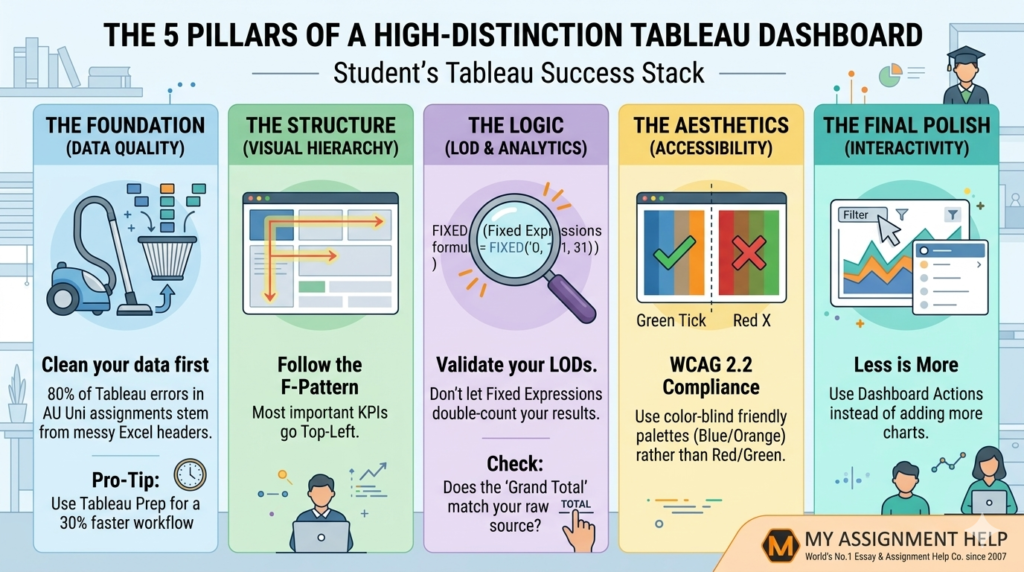
4. Poor Colour Choice and Accessibility (WCAG Compliance)
While a “Neon Green and Hot Pink” dashboard might look vibrant to you, it may be unreadable for your tutor or a colour-blind stakeholder.
The Pitfall:
Using colour to represent too many categories (e.g., 20 different colours for 20 Australian suburbs) makes the legend impossible to follow. Furthermore, failing to account for accessibility standards can result in a loss of marks under the “Professionalism” criteria of your rubric.
How to Avoid It:
- Limit your Palette: Stick to 2–3 primary colours. Use shades of the same colour to show intensity.
- Colour Blind Safe: Use Tableau’s “Color Blind” palette.
- Contrast is Key: Ensure text is easily readable against the background.
See also: FinTech: The Digital Transformation of Finance
5. Over-complicating the Data Source (Dirty Data)
Students often connect Tableau directly to an uncleaned Excel file and wonder why their “Dates” are showing up as “Strings” or why their “Postcodes” aren’t mapping to Australian states correctly.
The Pitfall:
Tableau is a visualisation tool, not primarily a data-cleaning tool. Trying to fix structural data issues within Tableau using complex calculated fields often leads to slow dashboard performance and “broken” links when the data is refreshed.
How to Avoid It:
- Clean First: Use Tableau Prep Builder or SQL to clean your data before importing.
- Data Interpreter: Use Tableau’s built-in “Data Interpreter” to handle merged cells or headers in Excel files.
- Professional Support: If you find yourself overwhelmed by the technicalities of data restructuring, seeking assignment writing help from experts who understand the Australian academic standard can save you from a “Fail” grade due to technical errors.
The “Academic Survival Stack” for Tableau
| Pitfall | Impact on Grade | Professional Solution |
| Overcrowding | Low Readability | Implement Dashboard Actions & Tooltips |
| LOD Errors | Data Inaccuracy | Use Validation Tables for Calculations |
| Poor Layout | User Confusion | Follow the F-Pattern/Visual Hierarchy |
| Bad Colouring | Accessibility Fail | Use WCAG-compliant, limited palettes |
| Dirty Data | Technical Errors | Clean data in Tableau Prep or SQL first |
Key Takeaways
Frequently Asked Questions (FAQ)
Q1: Why is Tableau preferred over Excel for Australian Business Analytics courses?
While Excel is great for data entry, Tableau handles “Big Data” more efficiently and offers superior interactive storytelling capabilities, which is a core requirement for the Australian Qualifications Framework (AQF) Level 7 and 8 degrees.
Q2: How can I make my Tableau dashboard load faster?
Avoid using “Live” connections for large datasets; use “Extracts” instead. Also, limit the number of “Quick Filters” as they require constant refreshing from the data source.
Q3: Does Tableau support Australian Geographic data?
Yes, Tableau has built-in support for Australian Postcodes, LGAs (Local Government Areas), and States. Ensure your geographic fields are correctly assigned as “Geographic Roles” in the Data Pane.
Q4: Is it considered “cheating” to get help with my Tableau assignment?
Seeking professional guidance to understand complex concepts like LOD expressions or data blending is a form of tutoring. Using a reputable service ensures you learn the correct methodologies while meeting strict university deadlines.
Author Biography
Lachlan McKenzie is a Senior Academic Consultant at MyAssignmentHelp. With a Master’s in Business Analytics from the University of Sydney and over 8 years of experience in SEO-driven content strategy, Lachlan specialises in helping Australian students master data visualisation tools. He has successfully guided over 1,200 students through the intricacies of Tableau, Power BI, and SQL, ensuring their submissions align with E-E-A-T standards and industry expectations.
References & Data Sources
- Australian Government (2025): Digital Economy Strategy & Future Skills Report.
- Tableau Software (2026): The Visual Analysis Best Practices Guide.
- HESA Australia: Graduate Outcomes Survey – Data Analytics & Salary Trends 2026.
- World Wide Web Consortium (W3C): Web Content Accessibility Guidelines (WCAG) 2.2.